
Designers have an … anxious … relationship with the idea of trends. On one hand, following the crowd feels wrong — after all, isn’t creativity doing anything but what everyone else is doing? To this line of thinking, the only value in knowing what’s trendy is knowing what you’re pushing against. You can’t simply do the opposite of a trend, of course. But knowing what the latest web design trends are makes it easier to subtly comment on and/or critique them.
On the other hand, there’s the idea that “creativity is knowing how to hide your sources” — a quotation often attributed to Albert Einstein, though more likely coined by humorist C.E.M. Joad. (Appropriate, no?)
Either way, it’s not hard to know what’s trendy. Just lift your eyes off your smartphone and take a look around — or don’t!
What matters is understanding the hows and whys of trends’ emergence and adoption. Because at the end of the day, trends have a lot to tell us about our cultural moment: what we love, what we hate, what we want to move toward. The closer we get to understanding those things, the closer we get to getting inside others’ heads — to empathizing with them. And, really, to understanding ourselves.
After all, when the art historians, fashion critics, and web designers of the future look back on our current era, what they’ll see and comment on will be the foremost trends of our day. When they discuss the aesthetics of the 20teens, they’ll really be discussing what was trendy — and what bucked the trends.
Trends, then, are history in the making.
Prefer to watch your trendy content?
We’ve got you, with a quick summary of this post from designer, podcaster, and vlogger Charli Prangely:
Thanks, Charli!
Now, let’s see what future historians will be saying about today. With a little help from a few modern tastemakers, starting with Zack Onisko, CEO of Dribbble, cool dad, and guitar noodler.
1. 3-dimensional illustration

Just when you thought the future was flat, brands like Pitch and Stripe are throwing their brand weight behind a new-old-fashioned form of illustration: 3D.
Not content with the cut-out illustration style popularized by Slack, designers are looking to add depth and realism to graphics designed to blur the boundaries between the digital and physical worlds.
In a sense, this sharpens the contrast between digital products and human beings, even as it brings them together into imaginary spaces where people can grasp and manipulate digital elements (like the graphs and icons in Pitch’s hero section). You can’t help but think of the popular assertion that Facebook’s real disruption is the way it makes us, its users, into the product — and wonder if designers aren’t subconsciously pushing against this notion.
Of course, if that’s the case, this feels like a merely incremental evolution. These designs don’t so much grant people their humanity back as render them from flat illustrations into cartoons.
With that in mind, perhaps Stripe’s much more realistic credit card animation offers a glimpse of a future where the physical and digital can be rendered as such.
2. From playful wordmark to serious logo — aka, the Helveticization of brand identity
In 2018, we saw several highly visible brands turn from delightfully eccentric brand identities to more … ahem … expected … sans serifs.
Or, as I like to put it: All brands identities eventually result in a Helvetica version.


Granted, none of the three brands we have in mind went straight to the old standby. And one — Mailchimp — evolved in a direction that honestly feels more fitting for a brand that’s made distinctive voice and playful brand assets a keystone of their marketing.
Still, for each of these companies, the rebrands can feel a bit like a too-familiar evolution toward what you could not-unfairly call staid, boring corporatism.
That said, you have to wonder if this shift from recognizably quirky to ubiquitously voiceless has to do with the notion of cognitive fluency: the idea that we are most comfortable with that which we’ve experienced before.
With the world’s biggest, most familiar brands all boasting serif-less logos, it’s little wonder that a step in that direction is seen as the hallmark of a company attaining maturity. In that sense, this is a kind of meta-trend we expect to see over and over again, and 2019 is unlikely to be an exception.
3. Outlined type
Like any design-driven brand, we’re big fans of typography here at Webflow, so we’re always on the lookout for new trends in text (look for more below!).
So when Zack called out the emerging trend in outlined type, we jumped to see what the new thing in letterforms held for us. Turns out — it was empty.


There’s something elusive about this kind of half-there, half-gone text that immediately draws in and holds the eye, demanding that you follow the letterforms to their natural conclusion. Which makes it a pretty handy technique for some memorable branding.
In a world where chunky sans serifs dominate branding, a visually lighter letterform certainly does capture a feel of traditional — but different. Which in the end is what any new brand needs: a sense that it’s both revolutionary and trustworthy.
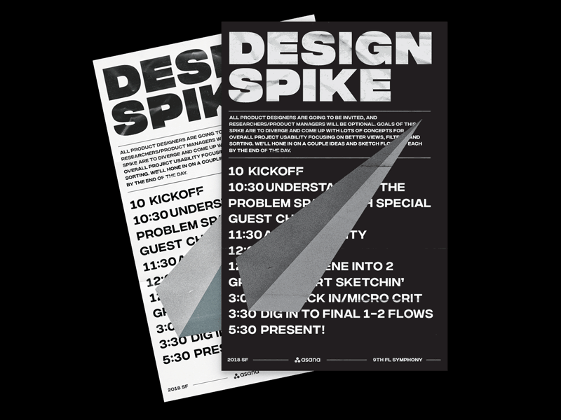
4. The continued rise of brutalism
We said it last year, and we’re saying it again this year:
The future will be brutal.
(Too real? I know. Sorry.)
There seems to be something particularly attractive about brutalism’s in-your-face aesthetic these days. Whether it’s as a natural pendulum swing away from the “clean” and “minimal” style that recently dominated the web — a rejection of the cutesy friendliness of a million brand’s voice and illustrations, a middle finger in the face of the so-called “homogeneous web,” or an act of resistance to the increasingly surreal blend of fact and fiction the web exposes us to daily — there’s no denying that brutalism has moved out of design’s subculture and into the fully branded spotlight.
Need examples? We got you:
And it goes way beyond internal meeting posters and iterative concepts. Squarespace’s recent rebrand embraces brutalism by way of New York City’s gritty visual aesthetic and brash personality:

Brutalism’s staying power suggests an interesting facet of design trends’ emergence and adoption that reminds me of the pop punk phenomenon of the late-90s (here’s to dating myself!): Whatever the trend, no matter how “rebellious” or “in your face” it might seem at first glance, it can and will be co-opted for the popular market. And that that growth from “subcultural” trend to mainstream mainstay can extend over multiple years.
As much as I’ve become a fan of the bold trailblazing brutalism tries to advance, I would ask designers one thing:
Remember, please, that there are people out there who find frenetic animations filled with dizzying, fragmented type and flashing colors extremely disorienting.
Design, like any other creative pursuit, doesn’t have to be for everyone all the time — but keep in mind that if you choose to include such things in your design work, you are deciding that your work isn’t for those who will find it dizzying, nauseating, and overwhelming.
But these things aren’t necessary to a brutalist design. If you’re looking to create an accessible take on brutalist aesthetics, check out David Copeland’s Guidelines for Brutalist Design, which reminds us:
By default, a website that uses HTML as intended and has no custom styling will be readable on all screens and devices. Only the act of design can make the content less readable, though it can certainly make it more.

5. More diverse, iconoclastic illustration styles
In her amazingly detailed and thoroughly fascinating case study of her work for Slack, illustrator Alice Lee reminds us:
Really awesome things happen when we look beyond our immediate peers, competitors, and industry for sources of illustration inspiration.
And while it’s easy to see Alice’s work kicking off an increasingly homogenous illustrative style among SaaS product companies and other startups, it doesn’t take a ton of looking around to find designers other than Alice mining the rich veins of work in other fields.
Such as the photocollage style being explored at Medium and Intercom.


But we’re also seeing folks inspired by the physicality of paper craft:

Three-dimensionalized takes on Alice’s mostly flat cut-out style:

And in wildly colorful physical/digital landscapes, such as that seen in CrowdRise’s current homepage:

It’s not hard to see echoes of Alice Lee’s work for Slack in all of these — her voice has become part of the modern design zeitgeist. But each of them extend her voice in intriguing ways, showing the creative potential inherent in looking outside what everyone else is doing, and blazing, even if tentatively, your own trail.
We’re even seeing designers embracing more abstract and surreal approaches to illustrate less concrete ideas, like staying scrappy:

Or “lifecycle marketing”:

As an abstract art fan, I’m very much looking forward to seeing more expressive, allusive pieces like these pop up across the web.
6. More adventurous and vintage type
While logo design work may be continuing to trend toward homogeneity, we and Zack are seeing some more eccentric choices cropping up as well, such as Mailchimp’s adoption of the (in)famous Cooper Black typeface (of Tootsie Roll fame!) for its brand font:

Abstract rocking the delightfully thick Vesterbro Black (and Regular and Heavy) in combination with Grilli Type’s America Mono:

And the delightfully chubby Recoleta in Pablo Stanley’s recent illustration library (which is full of echoes of Alice Lee!), Humaaans.

We called out the renaissance in serif fonts in 2018, but it seems that 2019 might be putting its quirkier, more nostalgic foot forward — at least in the headlines. Each of the retro-ish faces above feature full weight ranges, making them perfect for the flexibility that editorial work demands.
Thanks for the trendspotting, Zack!
Our next contributor is Sacha Grief, a designer, developer, and entrepreneur living in Kyoto, Japan. You might know him from his fantastic (and minimal) curated site and newsletter, Sidebar, or Vulcan.js.
He was kind enough to do his own short write-ups, so here’s Sacha’s trend list, in his own words:
7. Inclusive design

Many lines have already been written about the importance of accessibility, but rebrand it as “Inclusive Design” and you’ve got a whole new unclaimed buzzword to write books and essays about!
All kidding aside, thinking about the needs of a diverse set of users is never a bad thing, and if it takes a trendy concept to help us do it, I’ll take it.
Editor’s note: As you can see in the screenshot above, advocates for inclusive design often appeal to how inclusive/accessible design can help brands meet business goals. The logic is sound, but they shouldn’t have to.
It’s a simple act of humanity to make room for and accommodate others, and if you build inclusive thinking into your design process, the costs are no more than incremental, and can ultimately improve your user experience for everyone.
After all: we’re all disabled sometimes.

8. Design + code
While we were all agonizing over whether designers should learn to code, some of us quietly did just that — and used our newfound knowledge to develop better design tools. We’re seeing a new crop of design tools like Figma or Framer X that enable tighter integration with coding through APIs and plug-in systems.
Editor’s note: Not to mention tools like Webflow, which skip straight over APIs and plugins to let you design code. Oh, and if you’re a Figma fan, you should check out designer Charli Marie’s video on translating Figma designs into functional Webflow sites:
9. Bold typography
For some reason, any list of design trends always has to include “bold typography.” Seeing as typography has been around since 1439, you can’t really go wrong with that one. (Well, except for that brief period back in 2013 when Apple decide everything should now be set in Helvetica Neue Ultra Light).
Editor’s note: Guilty as charged, Sacha. More on this below.
Our next contributor is the inimitable Pablo Stanley. When Pablo’s not designing great things for InVision, or wowing the design world with his insightful, characterful illustrations, he seems to really enjoy digging into Webflow.
Especially since we launched …
10. CSS grid

Holy mole! I love Grid, man!!!
–Pablo Stanley
For many web designers and developers, flexbox has provided a kind of holy grail. It answers the age-old question of how to properly center things, both vertically and horizontally. It makes previously complex layouts relatively easy to implement. It even (quite literally) enables the fabled “holy grail” layout.
The thing is, it doesn’t give you control over the horizontal and vertical positions of elements simultaneously. That is, it’s a this or that tool.
Enter CSS grid: which lets you place an item exactly where you want it, both vertically and horizontally. Sounds simple, but the reality is that it unlocks a level of expressive freedom and control that previously only print could give us.
And yet: no one is using it.
Well, just about no one. Especially when you look at it relative to flexbox.
According to Chrome Platform Status, roughly 83% of page views include flexbox. CSS grid? Just 1.5%, roughly.
Why, you ask? Well, the answer, as it often is with web layout tools, is uneven support.

Or, more specifically, the never-unexpected absence of support (of iffy support) offered by Internet Explorer (IE), which despite being deprecated by Microsoft, is still disproportionately relied upon by many businesses.
Still, IE usage probably isn’t significant enough to fully explain the lack of grid adoption. So, consider that the stats cited above focus on page views, not pages. That means that it’s the lack of adoption of grid by major websites that more likely explains grid’s seemingly poor performance to date.
Which makes sense. These major platforms probably only went all-in on flexbox fairly recently. And rejiggering the layouts of sites that attract billions of users is no small task.
Thankfully, you probably don’t face the same issues in most of your work. And with Webflow, you don’t even need to spend hours mastering grid’s syntax. You can just use it. Today. Visually.
Get started with grid in Webflow.Why your design team should use WebflowDiscover how design teams are streamlining their workflows — and building better experiences — with Webflow.Collaborate easier

For our next guest design thinker, I turned to Los Montoya, lead designer at social app Mappen and creative director of Juxta Labs. Here’s Los in his own words:
I’m currently focused on leading design for both our Marketing and Product design efforts at Mappen and have gained a unique perspective on what’s to come in 2019.
11. Opposite approaches to color based on market position
In 2019, I expect to see more companies following the lead of other notable brands and pursuing softer and more approachable color palettes.
In contrast, we’ll continue to see indie designers’ and makers’ companies carving out attention with bolder, more saturated, and opinionated colors. We’ll still see a heavy use of illustrations in an effort to humanize technology and more importantly, humanize the brand.
12. Grid breaks grid
We’ll see the use of CSS grid as an underlying framework to break out of the “grid.” The proliferation and accessibility of CSS grid technologies will help designers and developers alike lean into broken layouts in an effort to bring “old-school,” print-inspired layouts to the web.
13. Mobile-first animation
Web design at the end of 2018 showed us an array of scroll-based animations and an inclusion of “timed animations” to help lead the eye down a marketing page. While this works well on the desktop breakpoint, we will see a more mobile-first approach to interactions in 2019. I’m looking forward to seeing how designers and developers bring facets of “desktop web design” into mobile-web design.
14. The year of great writing
I believe all of these to be natural evolutions from what we’ve seen in 2018. In a sense, visual design for both web and product has stabilized. We have a solid platform of tested and proven UX flows and interactions for both web and product design beneath us. The result is digital products and websites that tend to look like close cousins — if not siblings.
This is why, if you want to create a brand people love and your job is [Insert Desired Title] Designer, you’ll need to strengthen your storytelling skills and efficacy as a writer. It’s too easy to develop great taste from a visual design perspective. You have so many examples of beautiful designs to learn from. You have proven marketing funnel flows and digital product UX flows which are easily accessible to you, so you can design an experience that is easily understood by the majority of customers.
With that covered, 2019 will be the year of great writing. The year of great storytelling and narratives. Strip away the colors, animations, grids, and illustrations from a website and what you are left with is mostly words. Words matter in a website and words matter in product design. How and when you communicate to your customers as they journey through your app is crucial to giving you another chance at them coming back and hiring your app again.
Words are how you communicate with your team to get work done effectively.
Words are how you help a customer fall in love with your brand.
Words are how you tell people why they should care about what you’re doing.
2019 is the year to build something worth loving.
Our next contributor is Mariah Driver, Webflow’s very own content producer, punster, and accessibility advocate:
15. Too much motion
In Shakespeare’s As You Like It, Rosalind asks: “Can one desire too much of a good thing?”
Now, you’re probably wondering how we can possibly relate a pastoral comedy written in 1599 to 2019’s web design trends. Two words: motion design.
The trend towards animated and interactive elements is anything but new — and more importantly, it’s not going anywhere. Motion design can be a “good” thing in web design — when it helps users navigate sites.
The consequences of adding animations and interactions for the sake of visual flair, and not usability, can be far greater than simply distracting the user. In some cases, they can make it impossible, and even dangerous, for users to navigate your site.
For example, any display that flickers, flashes, or blinks can trigger people with photosensitive epilepsy. While this design element certainly makes a site memorable, it can quickly become harmful if it’s not used correctly.
We’ve included the site below to demonstrate the type of flashing display that may be harmful to certain users. Please do not click through to the site if you are sensitive to flashes or blinks:

To better understand how you can use flashes, flickers, and blinks safely and without sacrificing your site’s accessibility, check out the Web Accessibility Guidelines on seizures and flashes.
The takeaway from this trend?
Avoid the temptation to add motion to your site just because modern web design tools, like Webflow, make it possible to do so. Before adding an interaction or animation, ask if it serves a purpose on the page. And more importantly, if it could prevent someone from navigating your site.
Next up: little ole me.
16. Massive, screen-dominating text

Copywriters and other content specialists have long argued that content should always come first in the design process. After all, publishing for the web … is still publishing. And whether we’ve finally managed to convince the world of the value of content, or designers have just started to get really interested in letterforms, we’re starting to see websites that truly give textual content center stage.
Witness the above shot from makers of smokable products, Rolling Flowers. Pitched as an alternative to rolling tobacco, Rolling Flowers lets text do (most of) the talking on their (loudly) minimal ecommerce site.

And tosses in some incredibly large buy buttons to boot.
Or take this shot from a (for now) super-secret internal project:

Which sets the copy so large you’re forced to process the sentence in fragments, not whole phrases. (Hence, theoretically focusing your attention.)

Even Huffpost is getting in on the dramatically massive text shenanigans:

For reference, this is all I see on my MacBook Pro:

We’re also seeing this massive text trend emerge in creative menu designs, as you can see in the site of architectural firm Dot to Dot:

Intriguingly, the menu has moved out of the relative ghetto of a bar across the top of the screen to take center stage, so that its wayfinding system becomes, at least on the homepage, the “meat” of the site.
17. Playful cursor design and animation
To stick with Dot to Dot for a moment, it’s also worth calling out an emerging trend around making the most of the foremost tool of human-computer interaction: the humble cursor.
Because it plays such a vital role in the dynamics of human interaction with digital spaces, many of us are reluctant to mess with the cursor. But not all of us.
On Dot to Dot, for example, the cursor does a lot of work:


Webflow-using designer Niccolò Miranda has also put the cursor to more creative work than pointing and clicking on his portfolio site. On his homepage, the cursor cues you to click and hold, triggering a witty animation of him hard at work throughout the day.

18. All hail the new homogenous hero
Until very recently, we all shared a vision of the ubiquitous website. It looked a little something like this:
We even wrote a tutorial on building just this, in case your clients are clamoring for it.
But in 2018, that design began to metamorphose. Designers grew tired of the centered headline and button atop beautiful photo.
What’d they do instead? Move the headline and CTA to the left. Then shrink the image, set it to the right, and, maybe make it a custom illustration?
Et voilà! Behold the new homogeneous hero.


To be clear: I don’t think there’s anything wrong with this, personally. The headlines are getting clearer. The subheads add much-needed context. You always know where to find your call to action. Our urge for cognitive fluency — the sense of mastery we get when working with familiar things — is fulfilled. Jakob’s law is taken into account.

And centered text was never meant to be seen anywhere outside of wedding invites.
But it sure is trendy.
19. Overlap all the things
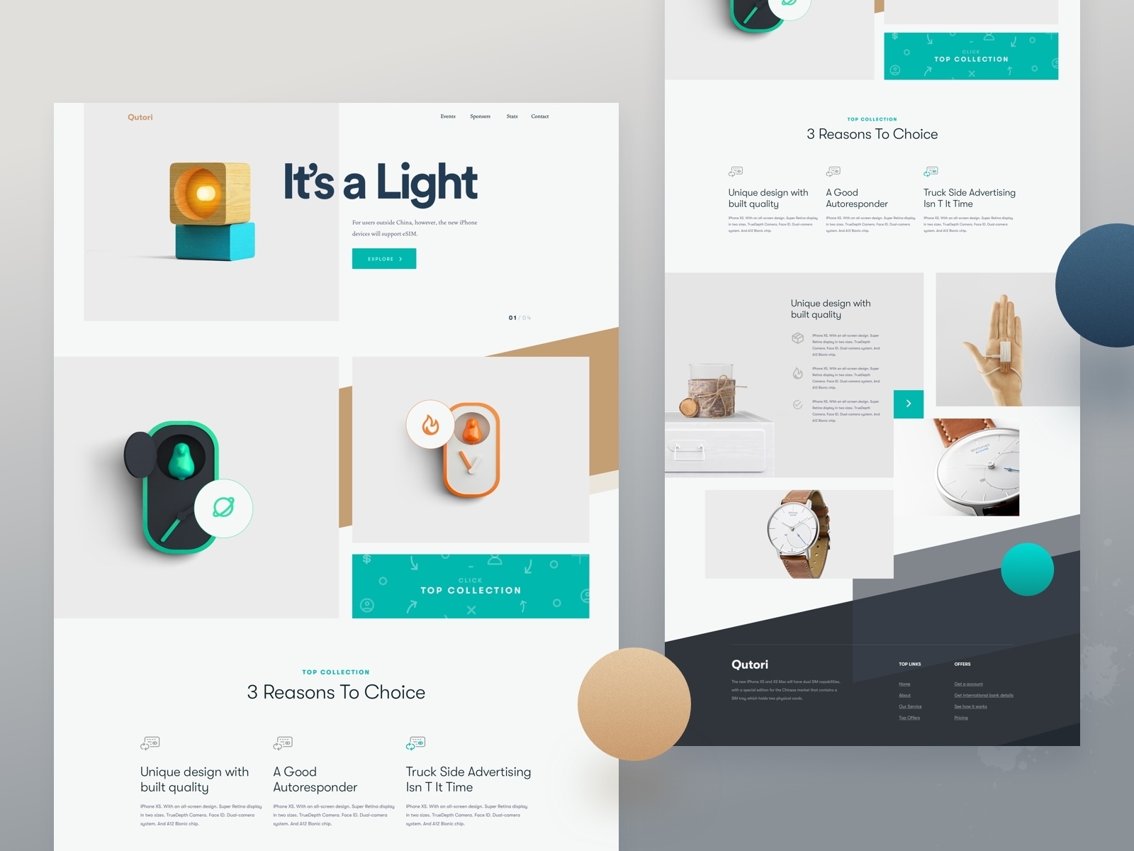
The era of card-based design got us all very into discrete objects with very clear, explicit groupings. It’s a sensible choice given gestalt psychology’s law of common regions.
But common regions aren’t the only way to visually link discrete elements. There’s also the law of uniform connectedness, which explains why it’s clear, in the design above, that “It’s a Light” refers to the lamp pictured on the left.
So in 2019, we expect to see a lot more exploration of ways to establish connectedness, like this newsletter module on NBC’s site:

And this customizable collage of photo and copy:

And in the site of Japanese creative agency, SONICJAM:

20. The year “users” fight back

Ever since the launch of smartphones and the rise of social networks, we’ve been reveling in an all-new level of connectedness. The world’s knowledge is at our fingertips. We can “befriend” (that’s right, kids: there was already a verb for that) almost anyone, anywhere. We “enjoy” constantly refreshing “feeds” of “content” “tailored” “just for us.”
And we’re growing tired of it all. We’re fed up with the invasiveness. The misdirection and dishonesty. The high-flown rhetoric about connecting the world in the face of news about leaks, media manipulation, and (maybe?) rigged elections.
We’re realizing there’s a monkey on our backs. And it lives in our pockets. And has always and forever only meant the best for us.
But that realization has many of us “users” wondering: is the price of admission worth the return on investment? Has the transformation from mobile “phone” to pocket-sized supercomputer cost us more than it’s brought us?
And if that’s the case: how can we correct the imbalance? Can we have our cake and eat it too?
But you, reading this, can’t just answer these questions as a “user.” You’re also, probably, a maker too. So in 2019, it’s time (it’s past time) to ask yourself:
What can I do to put people back in control of their engagement, their usage, their lives?