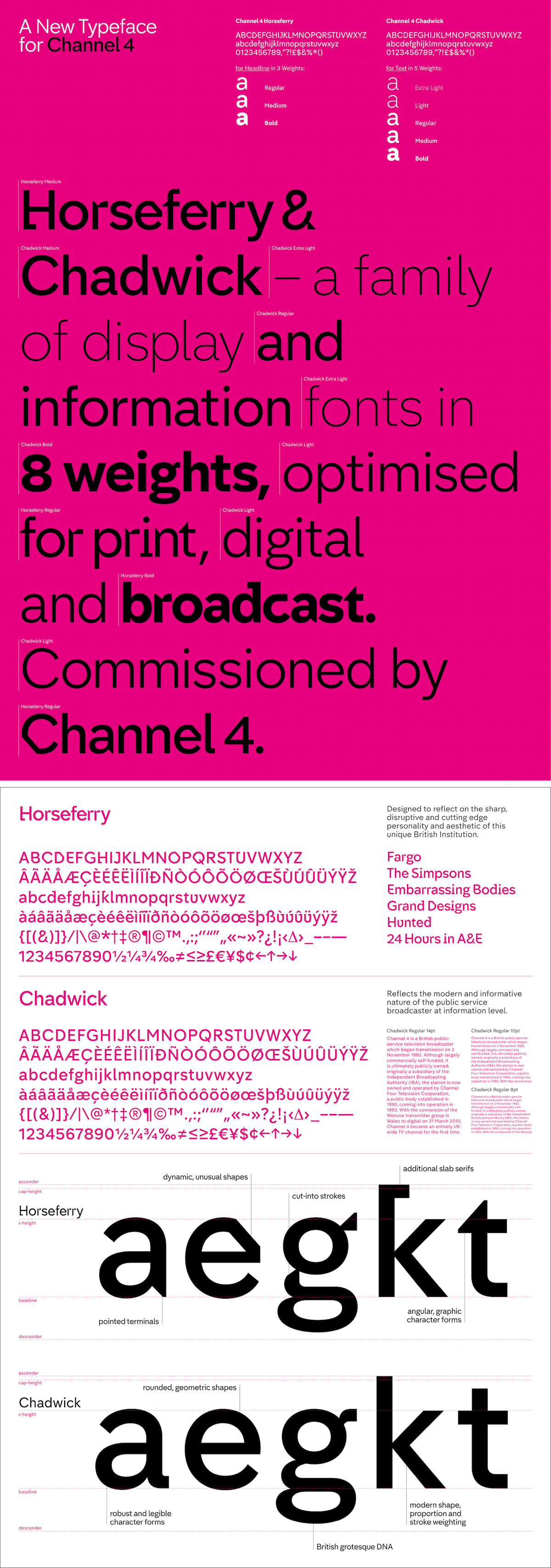
Channel 4 has launched a refresh of its branding, centred around a bold new take on its classic logo. Featuring idents from Jonathan Glazer and two new fonts from Neville Brody, the new look is dynamic, playful and at times a little bit bonkers…
The new identity comes ten years after Channel 4’s last brand refresh, but while ten years is a long time in media, the broadcaster’s previous look – which included abstract idents where the 4 logo appeared out of landscapes – hadn’t necessarily grown tired and was still much loved by viewers. With this in mind, Chris Bovill and John Allison, head of the channel’s in-house creative agency 4Creative (which is behind the concept for the new identity, alongside creative agency DBLG), describe the challenge of rebranding as “one of the biggest, scariest briefs we’ve ever had”.
Wisely then, when there is so much love for Channel 4’s iconic style, the team decided to keep the classic 4 logo originally designed by Lambie Nairn, though it will no longer appear in its full form on TV. Instead the 4 has been broken down into its constituent parts, which will be used across all of Channel 4’s branding, from on-screen graphics menus, to the new typeface, to the channel’s idents.
You can read the full piece by clicking here


