Contributed by Rosie Andrews of London-based MultiAdaptor.Quiqup
With well over 100,000 orders fulfilled, and millions of pounds of investment raised just one year into trading, Quiqup is a major force in the rapidly growing on-demand delivery market.
Whether it’s delivering dishes from your favourite restaurant (that doesn’t do takeaway); picking-up and dropping-off a last-minute gift for a special occasion; or running an essential errand you don’t have time to do yourself — Quiqup delivers.
Colour and imagery — bringing the freshness
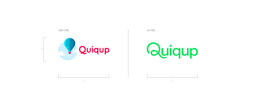
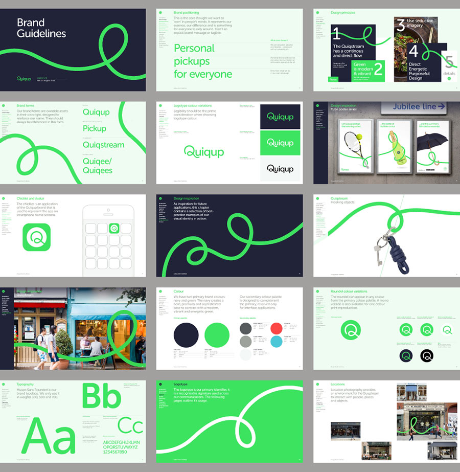
In a market flooded with red brands, we clearly differentiated Quiqup with a super fresh bright green — setting an energetic tone that reflects the fresh-from-the-kitchen and fresh-out-the-box promise of the on-demand delivery experience.

The big idea — Forever flexible
A truly flexible brand was required to reflect a truly flexible service. Unlocking and liberating the ‘loop’ in the Quiqup Q, we developed a framework to consistently communicate this quality, that is infinitely adaptable but instantly identifiable.
Ambition — Reshaping the way the world sees delivery
Quiqup are at the forefront of an exciting new market that transforms the established business models of delivery, courier, and even concierge services through technology.
Like the Uber of on-demand delivery, Quiqup brings benefits to their network of drivers and riders that deliver to customers; and to the bricks and mortar retailers — from the big to boutique and everything in-between — who are competing with the e-commerce giants that dominate consumer buying habits.

View more identity work on the MultiAdaptor website. Follow MultiAdaptor on Twitter


