Back
Branding Graphic Design Logo
July 1, 2025

Core Padel

These early concepts explored playful integration of padel rackets and balls into the letterforms. We tested a variety of combinations — from literal racket shapes replacing the “O” or “R”, to abstract forms playing with negative space. While impactful, these directions felt too illustrative and lacked the minimalist elegance the final identity demanded.


This direction brought in court lines and architectural shapes, grounding the logo more heavily in the space itself. The structured layouts offered a strong presence and visual storytelling, but leaned slightly too retro and graphic-heavy for the luxury feel we were targeting. These experiments helped clarify the balance we needed between sport, space, and sophistication.

Task

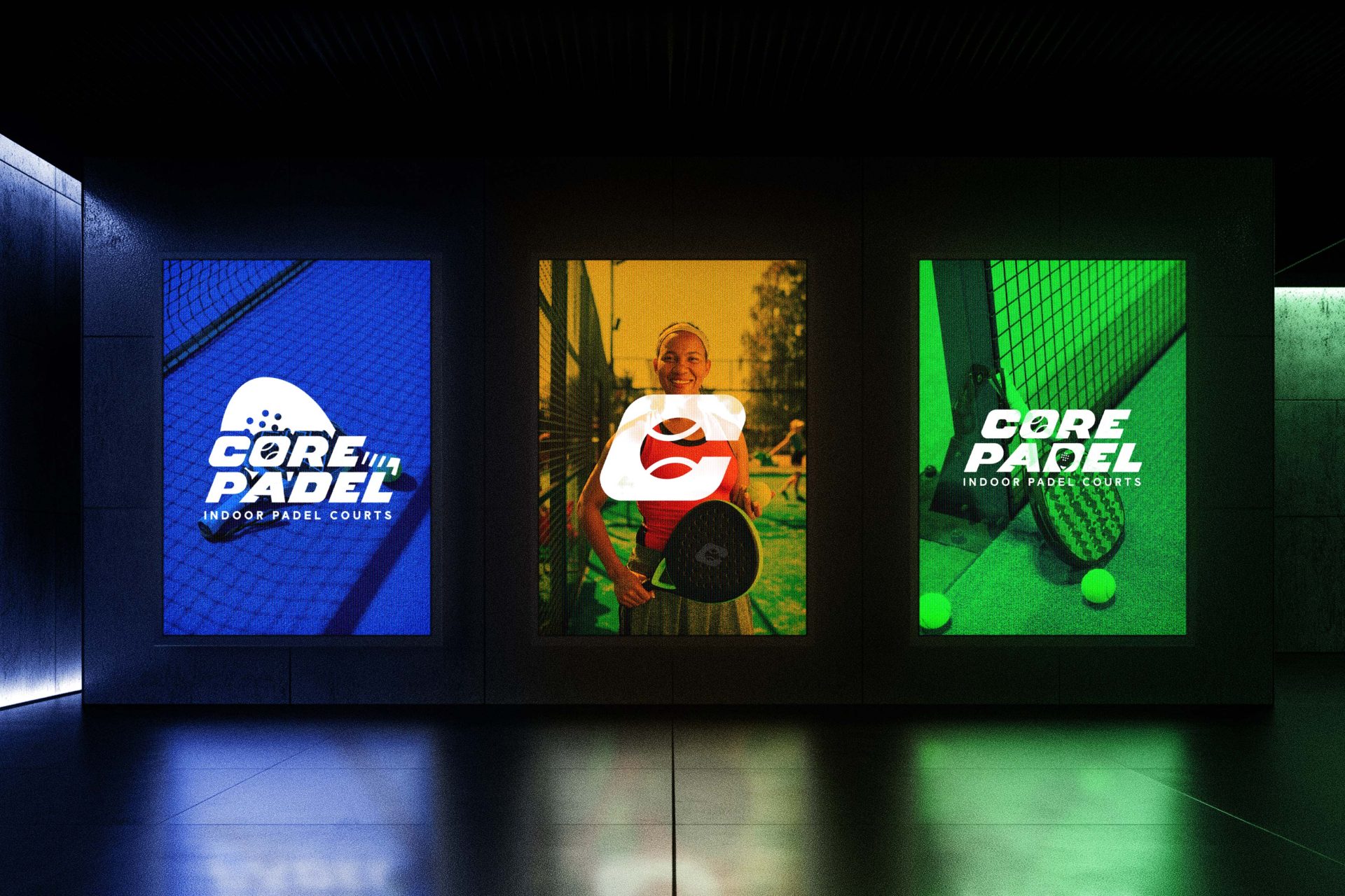
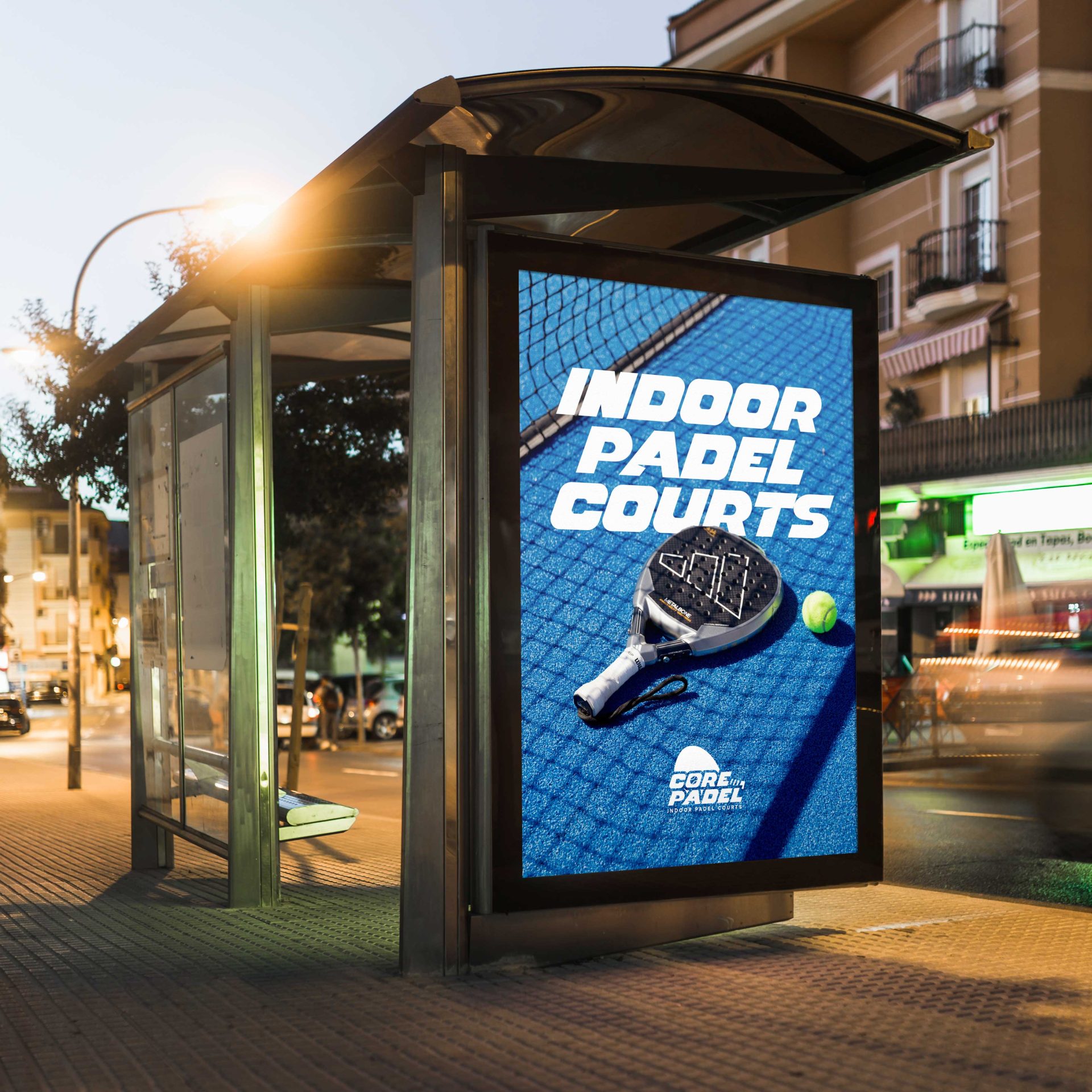
Core Padel is Birmingham’s first premium indoor padel club — designed for players who value performance and aesthetic in equal measure. As part of the brand identity for Core Padel, the client was keen to incorporate a visual reference to the sport itself — either the padel racket or the ball — without it feeling overly literal or cliché. The goal was to create a premium identity that nodded to the game in a subtle, stylised way. These early sketches explore different interpretations of that brief: integrating the racket into the letterforms, abstracting the ball into a ‘core’ graphic, and playing with symmetry and motion inspired by padel’s dynamic energy.
  • Strategy

    Brand Identity

  • Design

    Full Circle Brand Design

  • Client

    Core Padel

Leave a Reply

Your email address will not be published. Required fields are marked *